3D Pie Chart in Illustrator

Updated: April 5, 2014, Illustrator CS6
After seeing a Tweet on a unique visual resume concept by Michael Anderson (his blog post: Résumé / Infographics). I was intrigued by his use of a time line based resume and his pie chart that displays his primary skill-sets. Pie charts are wonderful ways of display percentage information but by also displaying information in a third dimension has its advantages to display more information visually. Pie charts are common in most software packages but not for a 3D. We will now create a sample 3D pie chart in Adobe Illustrator:
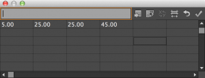
First, establish the information that you want to convey. For this example we will display a breakdown of a sample presentation, see table.
| Text | Bullets | Graphs | Images |
|---|---|---|---|
| 5 | 25 | 25 | 45 |
Second, in Illustrator, create a new document and select the pie chart tool.
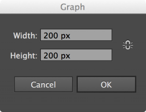
Third, establish pie chart size, for the example we selected 200px x 200px.
Next, Enter the pie chart data.
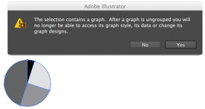
Ungroup the pie chart.
Select all the slices and rotate the graph for optimal 3D perspective viewing, we rotated the pie chart so the smaller slices will not be obstructed by the larger slices.
Select all the slices and select the stroke to none (it is important to set the stroke to none, this will prevent your extruded pieces from having a black colored side walls).
Select each slice and chose your desired color for each slice.
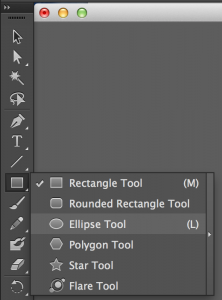
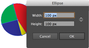
To make the graph a donut you will select the ellipse tool, for the example we created a 100px x 100px ellipse to create a circle with a 100px diameter.
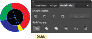
Align and center the newly created circle and the pie chart. Select all objects and select transform and divide.
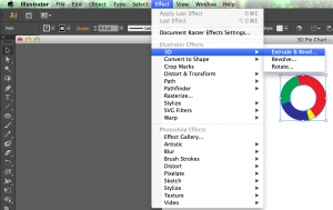
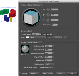
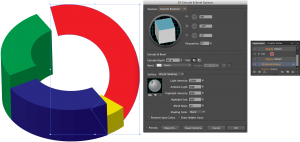
Ungroup and delete the unwanted center sections to create the donut shaped pie chart. Next select all the components of the pie chart, and select the 3D Extrude & Bevel Effect.
Rotate to a perspective that best shows all the slices and adjust lighting effects as desired.
Align all the slices (you may need to adjust the slice order so they display properly).
For this example we selected an extrusion height of 50pts. This will be the minimum height for this graph. We will now adjust the heights based on the data for the minutes per slide, since 50pt is the minimum and we will select 100pts as the maximum. This will allow us to ratio the minutes per slide to the following extrusion heights (Math to calculate height for each minute: 100pts-50pts / 7min-2min = 10pts per min):
| Time (minutes) | 2 | 3 | 4 | 5 | 6 | 7 |
|---|---|---|---|---|---|---|
| Height (pts) | 20 | 30 | 40 | 50 | 60 | 70 |
Select each individual slice and in the appearance history you can change the height of the slice to the desired height for your graph to display. After you change the heights of your slices you may need to readjust their relative positions. If you do not like the perspective view or your graph, you may need to adjust the the perspective angles of your graph, each slice will be as we did.
Label and you are set to go.
Interesting sites with examples of infographics:
- Information Aesthetics: http://infosthetics.com/
- Cool Infographics: http://coolinfographics.blogspot.com/
- Smashing Magazine: http://www.smashingmagazine.com/…infographics/
- Infographics News: http://infographicsnews.blogspot.com/
- TED, Hans Rosling: http://www.ted.com/talks/hans_rosling_shows_the_best_stats_you_ve_ever_seen.html
- TED, Jonathan Harris: http://www.ted.com/talks/jonathan_harris_tells_the_web_s_secret_stories.html





Thanks Scott, well explained and useful
What am I transforming it to (under effects-distort and transform)? I am lost at that part. Also, I can’t seem to delete the unwanted parts once I have the ellipse tool and entire chart selected. I end up deleting the ellipse tool only or the selected slice of the chart w/ the ellipse if I try to delete. Never just the unwanted section.
@kfooks, interesting I tried dividing by using: Effect > Pathfinder > Divide and by Object > Path > Divide Objects Below and both methods did not work. The only way I have been successful to ‘cut’ the pie chart with the circle/ellipse is by using the shortcut divide via the pathfinder control box. You can activate the control menu for pathfinder via: Window > Pathfinder, then select the objects you want to divide (the pie chart and the circle) and Select the Divide Icon on the pathfinder control box. After that all the parts should be grouped, ungroup and delete the undesired parts. I hope this helps.
Forgot to post this, if you want to add some transparency to your 3D graph check out this tutorial: http://mediadesigner.digitalmedianet.com/articles/viewarticle.jsp?id=31554-1&afterinter=true
I would like toadmitthat all of your articles are of great helpas they givewonderful guidances.Wishing u all the best for your future articles and expect them also to help me similar to this.